Navy
Trust, authority, institutional strength, responsibility, depth and continuity. The dominant colour.
Our identity
The corporate mark is the principal public symbol of the Foundation. It carries the philosophy in visual form.
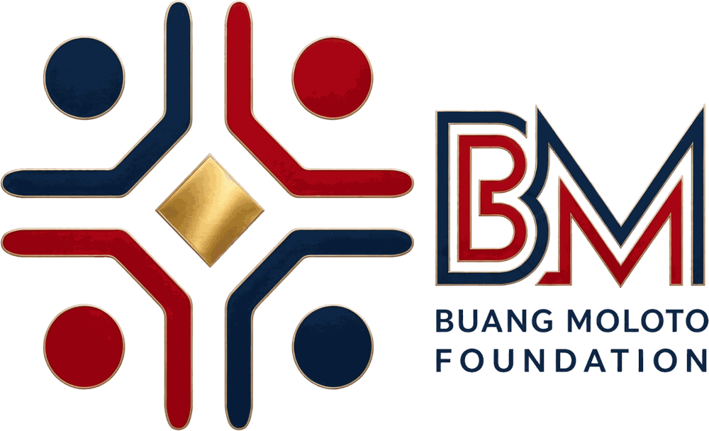
They represent people, communities and generations. No figure dominates another. Raised arms may mean celebration, welcome, victory, praise, participation and shared joy. Transformation happens through participation — not one powerful person standing over others.
Human worth, potential, purpose, talent, possibility, achievement and excellence. The precious value that may already exist even when circumstances obscure it. The Foundation gathers around that value. It does not create it. It recognises it.
Community is not merely where programmes happen. Community is part of the solution. Our preferred approach: with communities, not merely for communities.
Trust, authority, institutional strength, responsibility, depth and continuity. The dominant colour.
Life, energy, courage, action, sacrifice and warmth. Used to add pulse, not to overwhelm.
Value and excellence. Used with restraint — discovered, never sprayed everywhere.
Masterbrand
The BMF corporate identity takes centre stage across the Foundation. Rustenburg Arts Showcase, Season of Light, The Cross, Serenade Her, Community Relief, Sports and future programmes express their own story through wording, photography and campaign narrative — without becoming separate brands. The current exception is the Buang Moloto Choral Showcase, which retains its distinct programme identity while remaining an initiative of the Buang Moloto Foundation.
The founder identity is not a competing corporate logo. It is used selectively where Buang Moloto’s personal journey, reflection, testimony or mentorship is itself part of the story.